Dalek Triptych
Daleks are iconic recurring enemies from the British TV show Doctor Who, beloved for their resemblance to an angry trash can with a toilet plunger and an egg beater strapped on.
I started out this project thinking that I would make an Andy Warhol-style print of several Daleks in bright colors. However, the block-print ink was too thick and tacky to work with, and I'm too chicken to try spray paint. I got fairly good results with stamp ink pads, and then decided to experiment with a few other classic art styles.
This triptych features the Warhol Dalek, La Trahison des Daleks, and, of course, the Pollock Dalek.
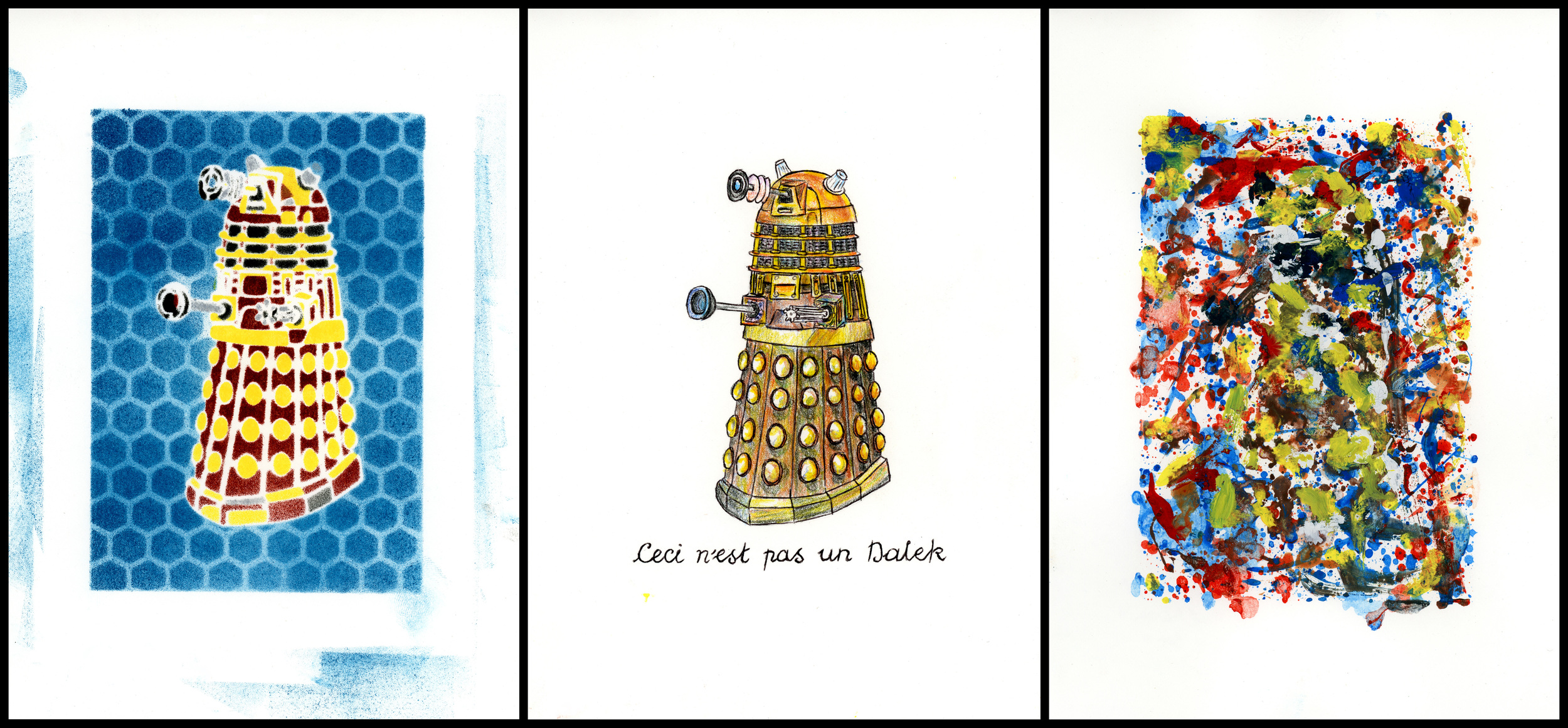
Dalek Triptych
The final product. I had planned to have each piece framed with a thinner white margin so that the extra blue ink would not show, but this feels more balanced.
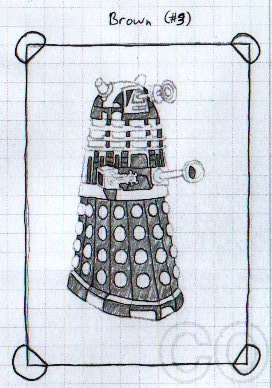
Preliminary sketch for the Dalek Triptych
I used carbon-copy paper to sketch out the main design and trace several copies. Each copy served as a prototype plate while I worked out how many colors I would need. A fine use for my old Chemistry Lab notebook!
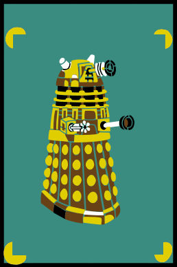
Dalek Triptych Color Concept
I scanned my original sketches into Photoshop and traced them to make a vectorized image for the laser cutter. I also tested out different combinations of the colors I wanted to use. I was confident enough in the colors that I went out and bought the ink before testing whether it would work with the stencil. Whoops.
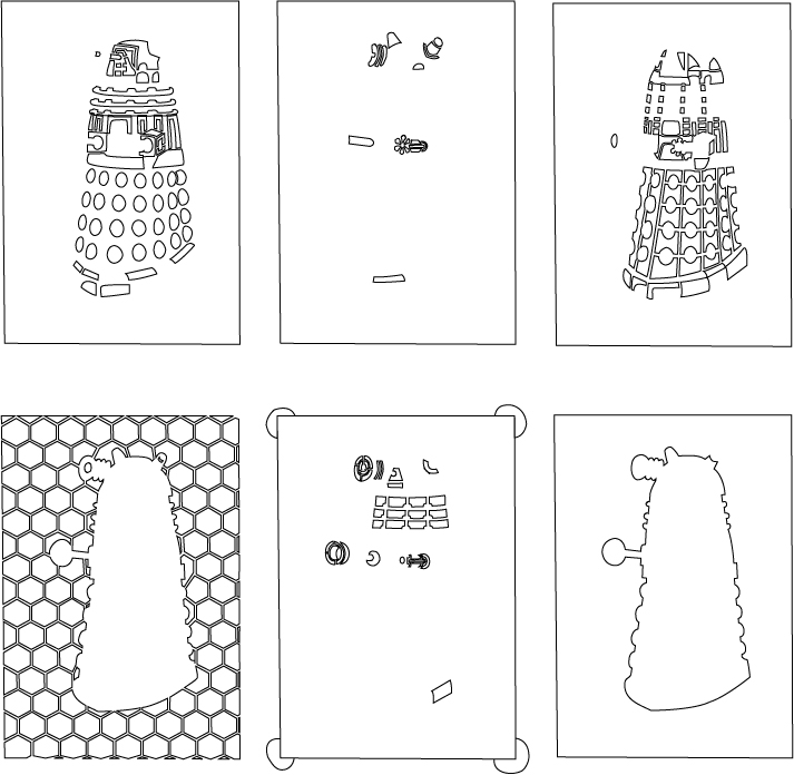
Laser-cut templates
I had my templates laser-cut at danger!awesome, a laser-cutting and 3D-printing studio in Cambridge, MA. The studio is, indeed, awesome. Lasering through wood pulp feels like humanity's ultimate mastery over fire.
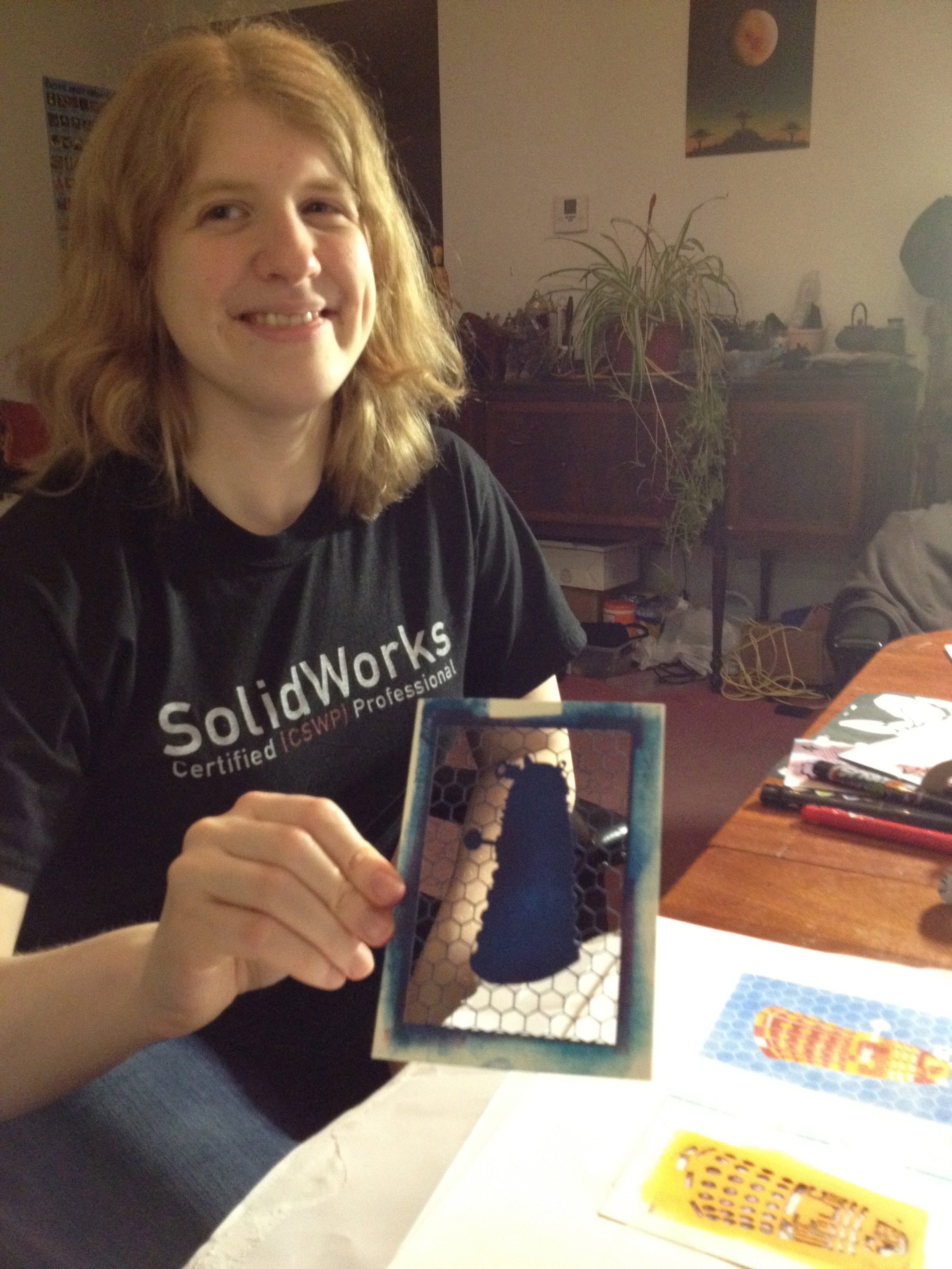
Dalek Triptych ink-stamping process
For the blue background of the Dalek image, I used thin struts to keep the color mask in the correct place. I also had a smaller free-floating mask of just the Dalek without the frame. If I had used spray paint I could have used the free-floating mask by itself, with weights to hold it down, but I barely know how to use hairspray, so... no.
I did one pass with the blue ink to establish the outline, and then held the free-floating mask in the right place so I could go over the whole thing again and fill in the bits that had been covered by the hexagonal struts. I was hoping to establish a solid background color, but the stamp ink turned out to be too translucent to hide the strut pattern. The resulting texture means the style is not quite Warhol, but I'm mostly okay with that.
